Top 5 Mistakes Brands Make When Creating Digital Product Visuals

Digital product visuals are often the first impression your audience sees — yet many brands get it wrong. A stunning 3D render or animation can make your product pop, while poor visuals can make even the best products feel unprofessional.
At VM, we help brands create photorealistic 3D renders and animations that drive engagement, improve product launches, and help convert potential customers. Here are the top 5 mistakes we see brands making — and how to avoid them.
1. Using Low-Quality or Inconsistent Assets
A common mistake is relying on low-resolution textures, inconsistent lighting, or poorly modeled assets.
Why it matters: Inconsistent visuals break trust. If your product looks amazing in one image but dull or off in another, potential customers may doubt its quality.
How to fix it: Invest in high-quality 3D product renders or professional photography. Ensure lighting, textures, and angles are consistent across all visuals.
Pro tip: Check out some photorealistic 3D product renders we did for FOX for examples of consistent, high-quality visuals.

2. Ignoring the Platform or Medium
Your visuals need to look great everywhere — desktop, mobile, social media, or large-format displays.
The problem: Many brands design for only one platform, resulting in cropped images, unreadable text, or visuals that fail to highlight key features.
The solution: Design adaptable assets for each platform. Test your visuals in multiple formats before launch to ensure clarity and impact.
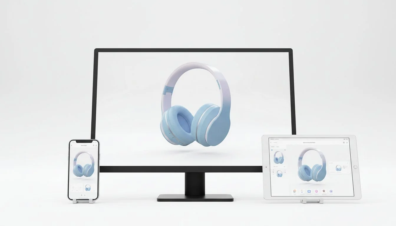
Make sure to plan for all platforms you plan to use.
3. Overcomplicating the Visual
Less is often more. Overloaded visuals with too many effects, props, or busy backgrounds can distract from the product itself.
Example: A spinning 3D model with flashy lens flares may look cool but fails to communicate product features.
Solution: Keep the focus on the product. Simple backgrounds and subtle animation can highlight key features more effectively.
See how we designed a simple environment for an Xbox controller while creating high-impact product visuals.
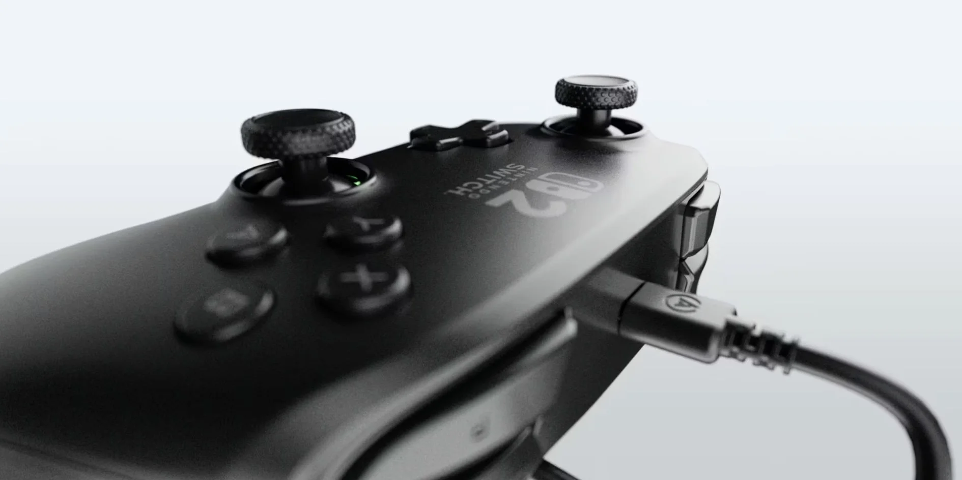
This black Nintendo Switch 2 Controller needed a simple and clean environment to pop.
4. Skipping Motion and Interaction
Static visuals often fall short when showcasing products that benefit from movement.
The problem: Flat images for tech gadgets, apparel, or lifestyle products can’t demonstrate functionality or fit.
The solution: Incorporate 3D animation or interactive visuals. Even a short 5-second product animation can convey more than static images.
Check our 3D animation reel to see motion bringing products to life.

5. Not Considering the Customer Journey
Visuals should guide the customer, not just look pretty.
The problem: Images that are aesthetically pleasing but fail to communicate scale, use cases, or benefits leave potential buyers confused.
The solution: Design visuals that educate, engage, and convert. Think about your customer’s questions and ensure your visuals answer them.
Conclusion
Creating high-quality digital product visuals isn’t just about aesthetics — it’s about strategy. Avoid these 5 mistakes, and your visuals can do the heavy lifting for your brand, boosting engagement, trust, and conversions.
Ready to bring your products to life with photorealistic 3D renders or animations? Reach out today and see how we help brands like yours turn ideas into visuals that sell.